List
Visual Brand Guidelines

Old Town Entertainment District
Visual Brand Guidelines
For all specific principles and design elements that ensure consistency and cohesion in the visual representation of the brand, this section provides clear instructions on how to use the logo, typography, and other visual elements.
1
Logo
Experience Kissimmee's primary logo color is Jade. Secondary logo color options are for special use only.
To ensure readability, the logo should always have a buffer space that no elements should intrude. The size of this space is proportional to the “ee” mark on all four sides.

Logo Sizing
The minimum height of our logo is 21 pixels on screen, or 0.29 inch for print, measured by the cap height of “K”. In rare situations, smaller sizes for print may be necessary. In those cases, legibility should always be your top priority.

Logo Usage
To ensure readability, the logo should follow certain guidelines and not be misused to misrepresent the brand.

2
Typography
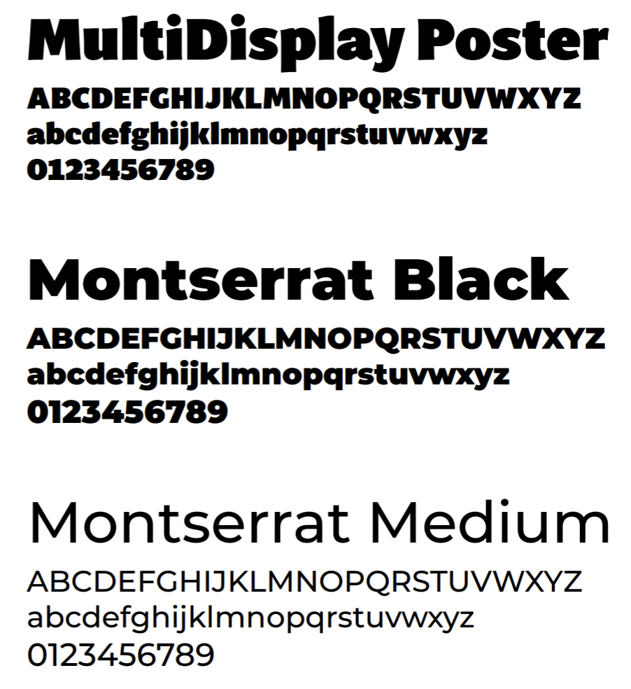
Primary Fonts
3
Brand Colors
The expanded color palette of Experience Kissimmee is inspired by the adventures and activities offered in the destination. They reflect the soothing and stimulating experiences our visitors can encounter. The hero color for the brand is Jade.
